Cannabis Canada
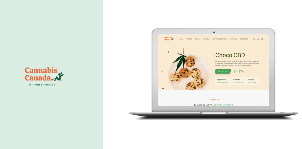
Cannabis Canada – A mail-order service for Canadians wishing to purchase quality cannabis products for recreational use.
Introduction
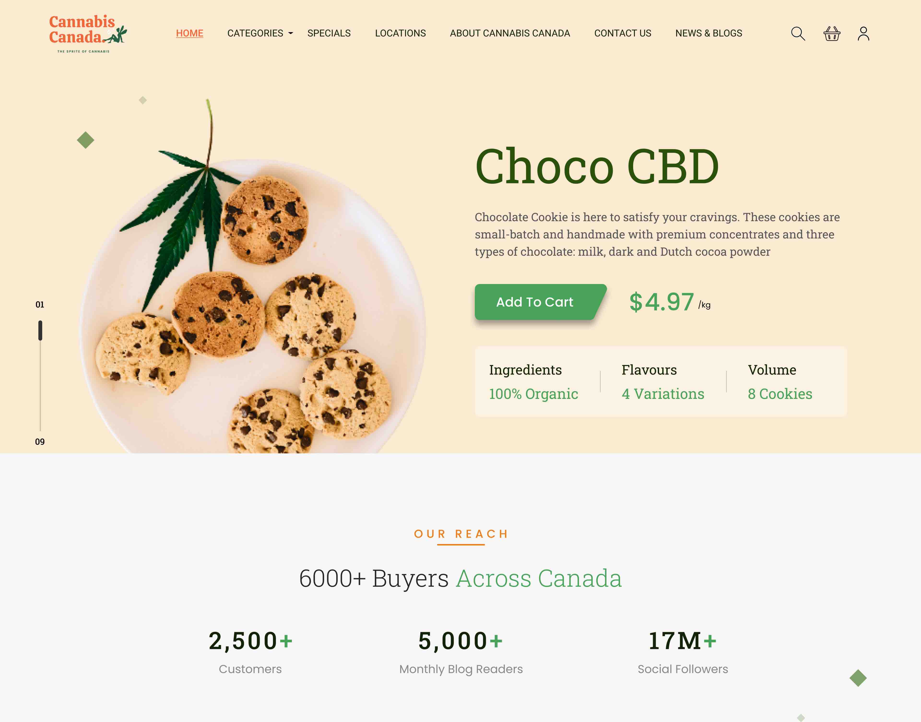
Cannabis Canada is a mail-order business for Canadians interested in buying high-quality cannabis products for recreational use. Still, we discovered that many consumers were unaware of its existence. To grow and boost business potential, we are marketing the brand and its services by developing a digital product (website) via which individuals (Canadians) will be able to acquire cannabis products for recreational use via Cannabis Canada.
Business Goals
Long-term
Goals
- To increase brand awareness and name recognition
- Raise the total profit margin of your business by 15% in the next four years. To meet our long-term objectives, we must expand our client base and improve the customer experience for current customers by making Cannabis Canada digitally available online and, therefore, more accessible to customers.
Short-term Goals
- To create a website to sell products
- Allow customers to find more information about the products and services
- Make it easier for the customers to place the order
- cross-sell to long-term customers
By achieving our short-term objectives, we will be able to establish a digital presence, allowing customers to connect with us online to buy products and obtain more information about them, resulting in increased sales and lower sales costs for the company. Personalized suggestions based on user profiles assist users in finding related products in a hassle-free manner, resulting in increased sales for the company.
Usability tests will be performed on these tasks and iterate your design if necessary based on the outcome of testing. Can revise these tasks once you have completed your competitive analysis if anything important is missed.
01
Design Process
Empathize
- Establishing Business Goals
- Competitive Analysis
Define
- User Personas
- User Scenarios
Ideate
- Assume a beginner’s mindset.
- Card Sorting
- Tree Testing
- Site Map
Prototype
- Wireframe
- High Fidelity Prototype
Test
- Usability Testing
02
Competitive Analysis
Direct Competitors
- Hunny Pot Cannabis
- Toronto Hemp Company
- Gas Dank
- Your Local Cannabis
Indirect Competitors
- Hunny Pot Cannabis

Overview
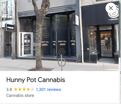
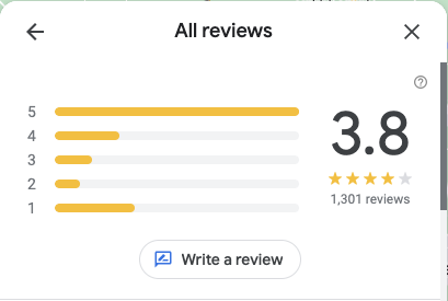
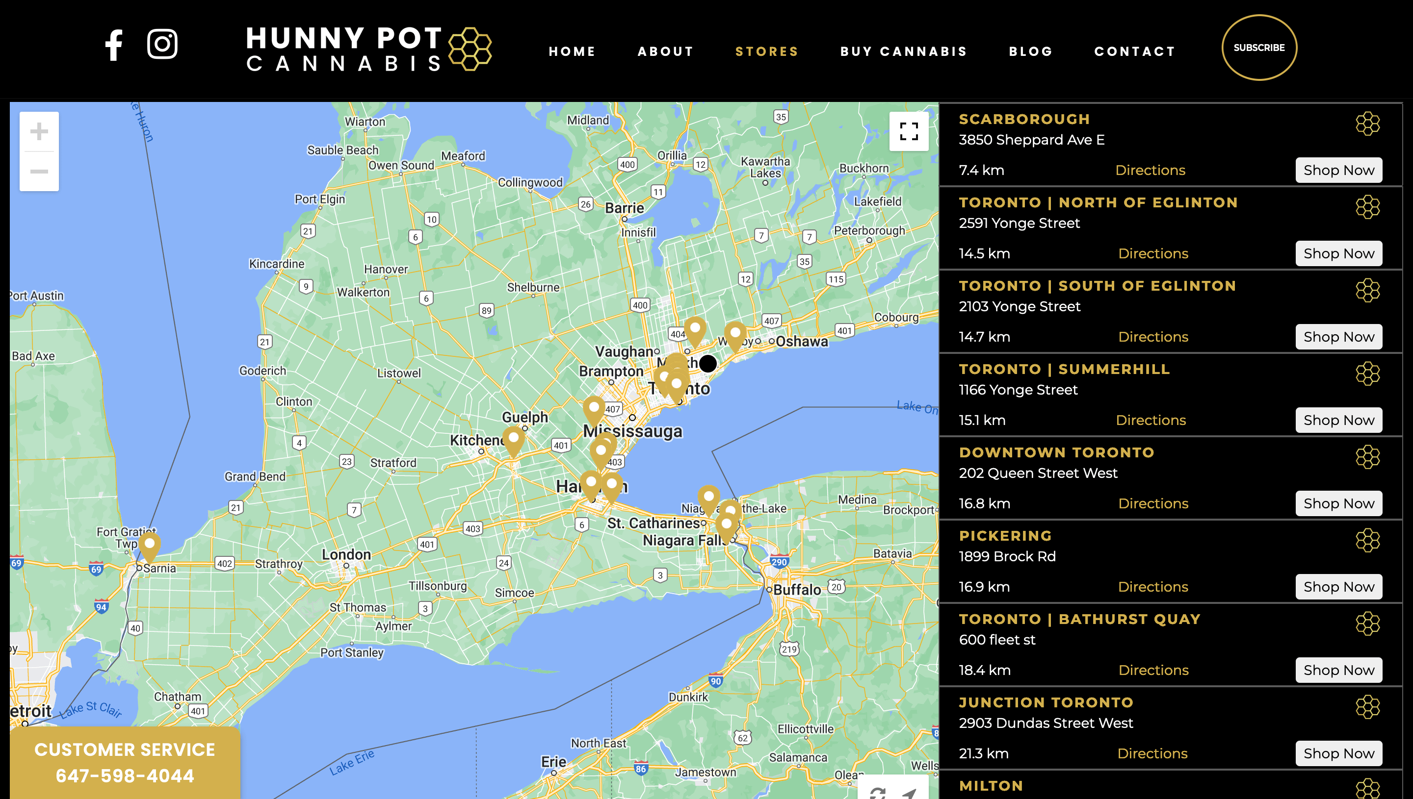
Toronto’s very first legal cannabis store, opening our flagship location at 202 Queen Street West on April 1st, 2019.
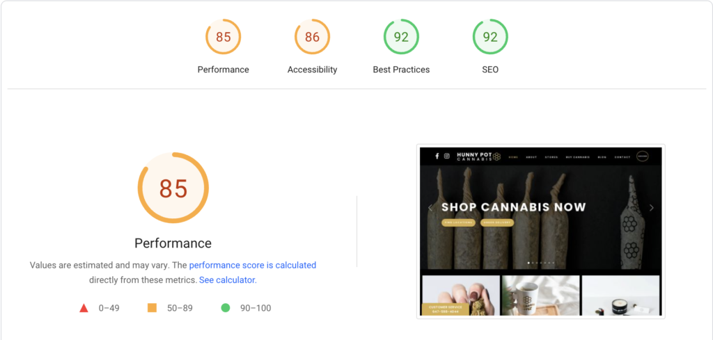
The website and the colour scheme convey a luxury feel. The content conveys a welcoming and comfortable feeling regarding the things supplied on the website.
Website Analysis

Best Features
- Prominent customer care feature to help users at any point in time
- Very intuitive store locator
SiteMap & Analysis
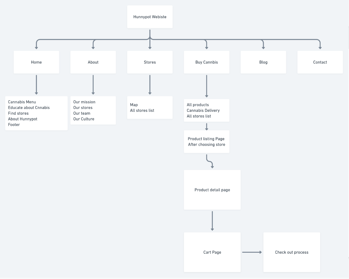
- The clicks to buy a product is 7, which is relatively on the higher numbers.
- Users have to go through many steps to see the product description

Overview
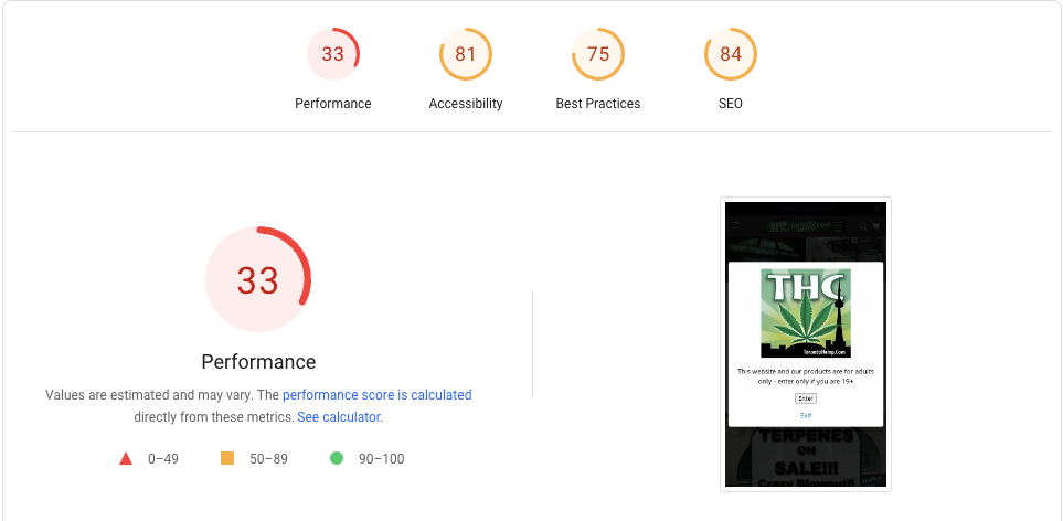
Toronto Hemp Company (THC) is perhaps the world’s largest and most significant cannabis culture/hemp/pot/bong/vaporizer/head shop! Established in 1994 and located in the heart of downtown Toronto, THC is a “hemp shop,” “head shop,” or “smoke shop,” or cannabis/marijuana/hemp culture store” – a retail store and resource center providing high-quality hemp and related products and information.


Website Analysis
Best Features
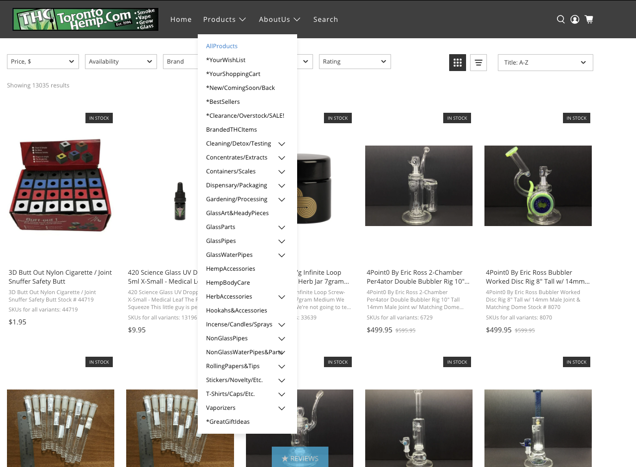
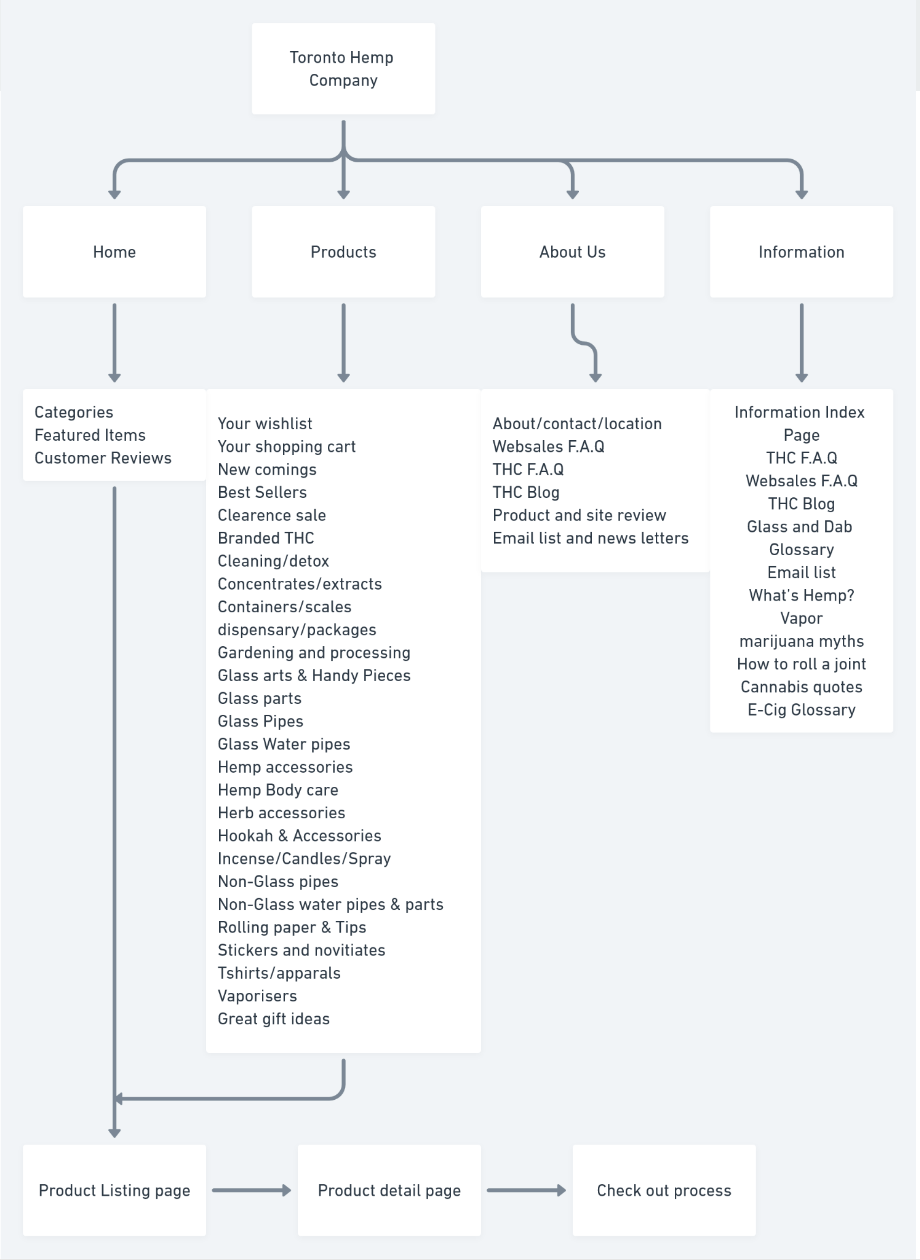
Minimal clicks are required for the users to purchase the product.
Sitemaps & Analysis
The categories have overwhelming amount of data takes time to go through each and every content

Overview
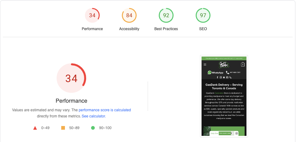
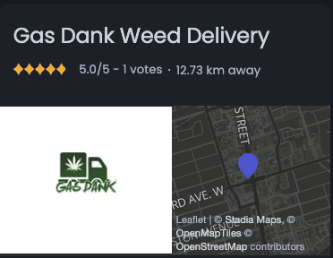
Gas Dank is Canada’s premier mail-order service. We provide same-day delivery across the GTA and express mail delivery across Canada. They assist users in discovering our world of carefully crafted premium cannabis. They were established in 2018.
Website Analysis
Best Features
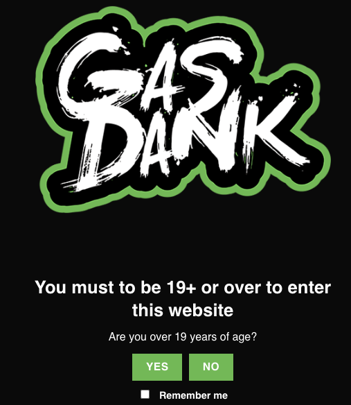
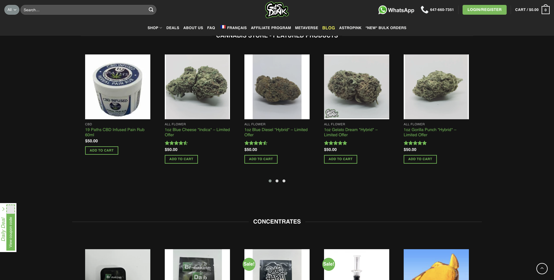
- For color-blind people, it is difficult to read the call-to-actions visually.
- Considering the communication, they have provided the WhatsApp contact, mobile number, and email to mail if users want to know anything.
Sitemaps & Analysis
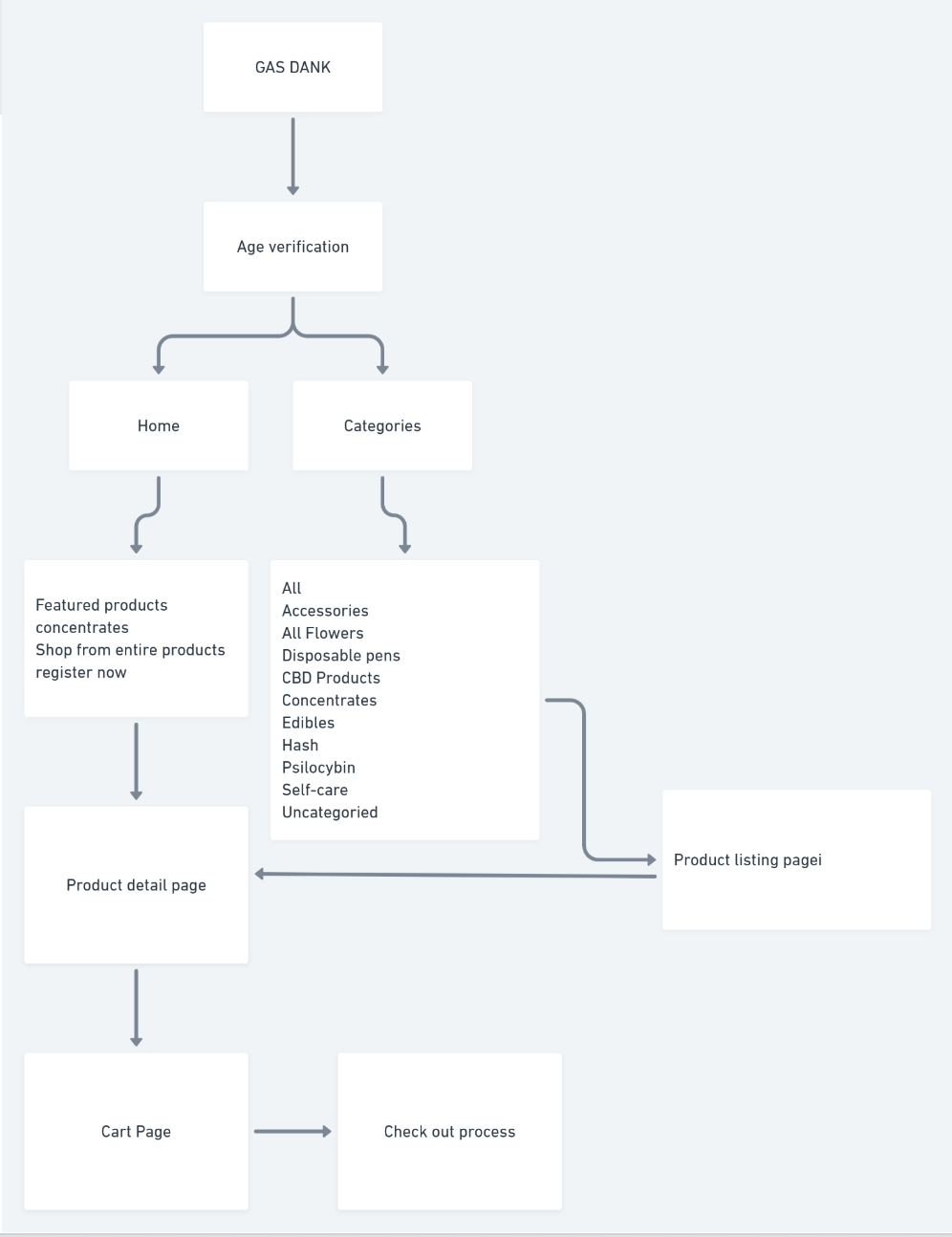
Pretty straightforward in terms of the flow and easy to buy the product.

Overview
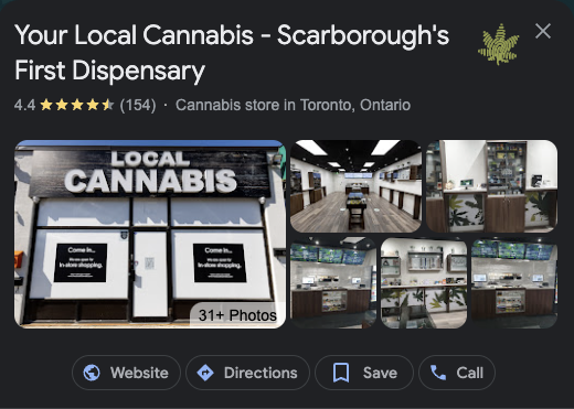
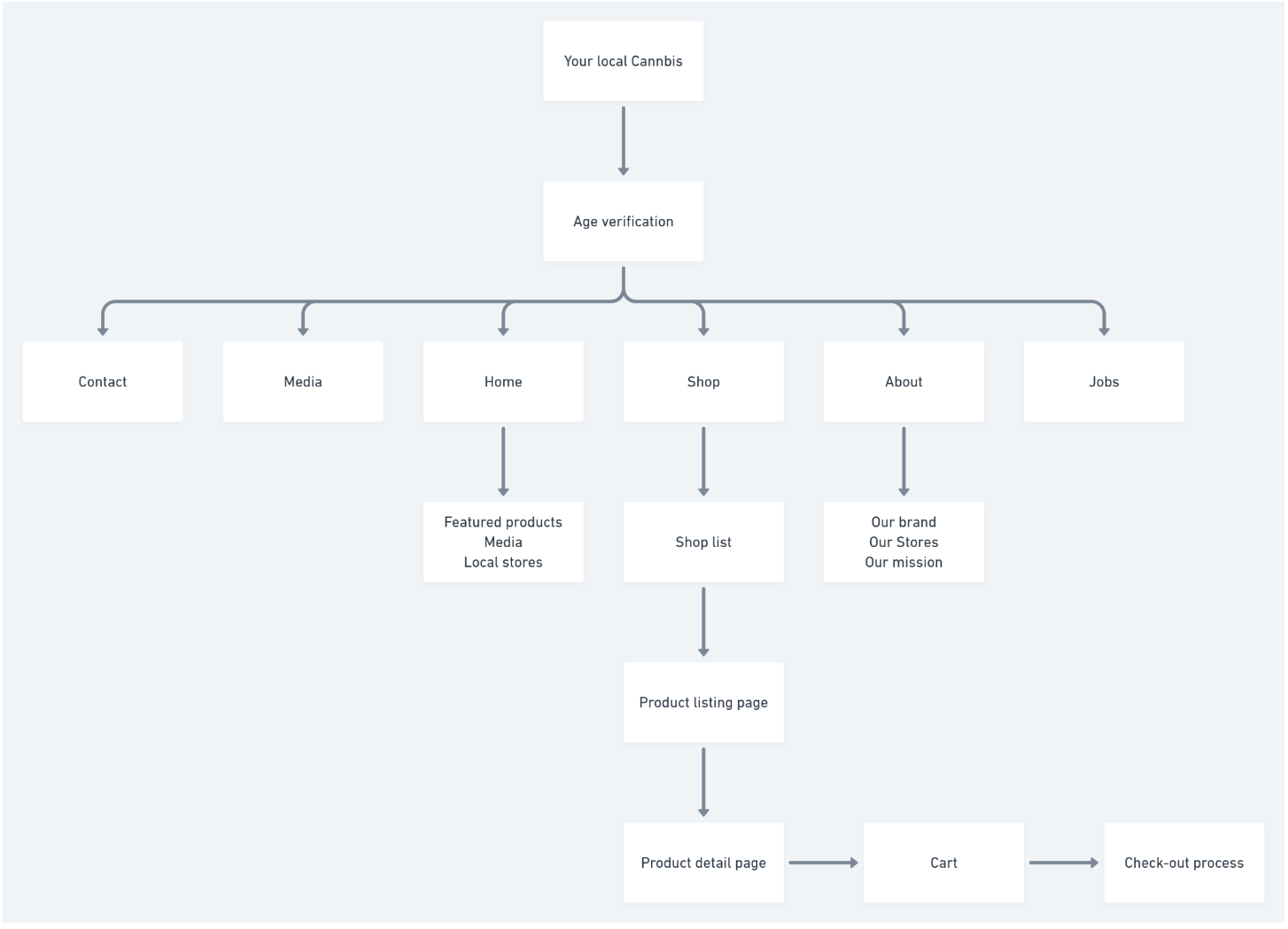
Local Cannabis Scarborough’s first legal and licensed retail cannabis store. They are direct competitors and have multiple stores in Scarborough, which appear to be premium and focused on quality.
Website Analysis


Best Features
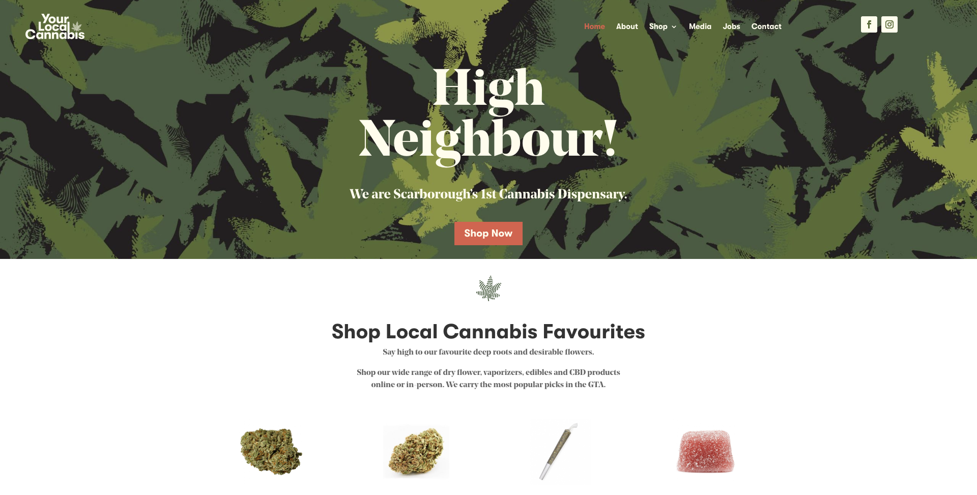
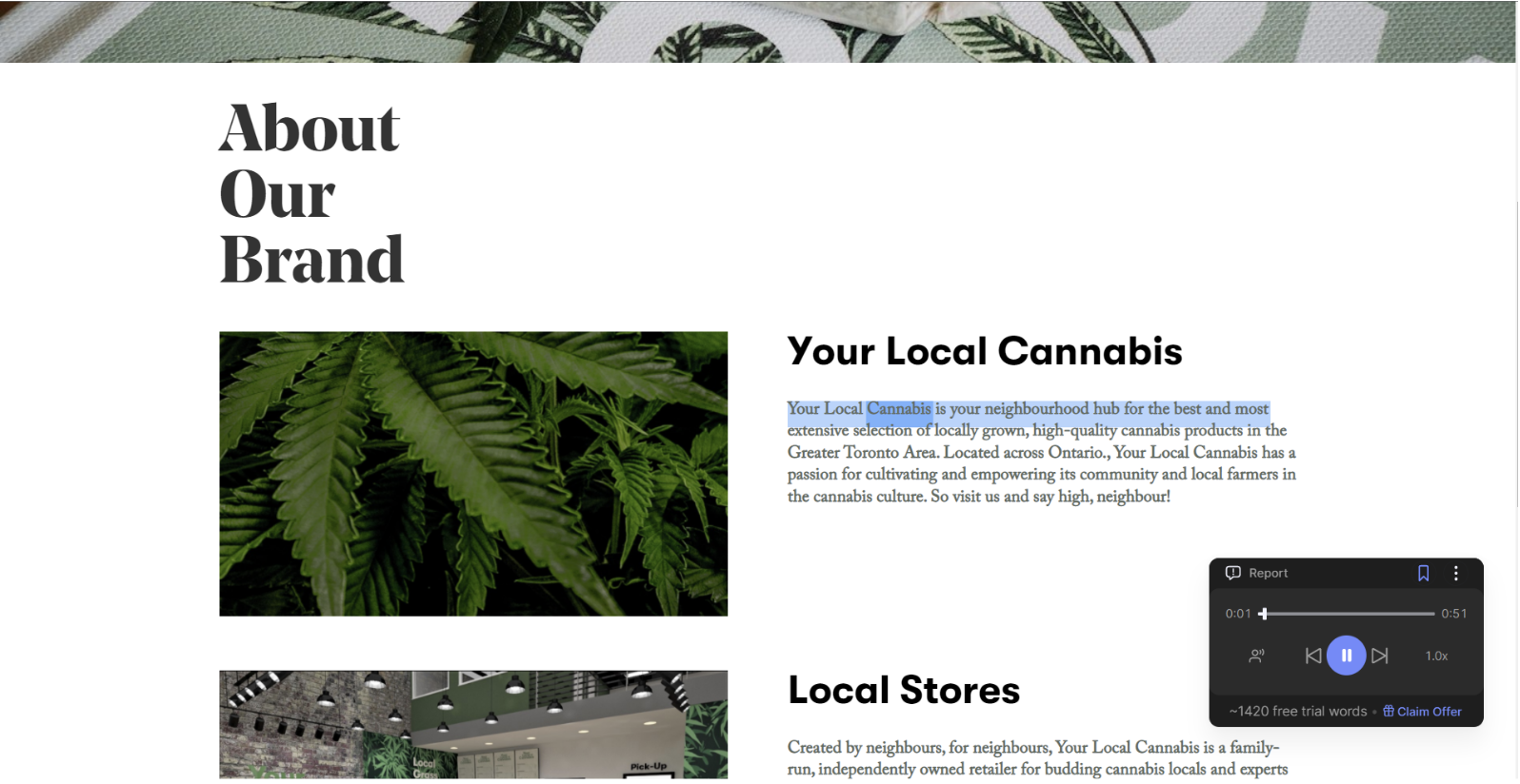
The information architecture of the website is good and seems appropriate but considering the clicks to buy a product is 5 which is relatively good. Interactions used in the website for the people to navigate and understand is good along with that website is incorporated with the accessibility assisting features which adds value in terms of the inclusivity, for example, reading the passages for the people.
Sitemaps & Analysis
The site map is clear and follows the traditional e-commerce template, which reduces the cognitive load for the users.
03
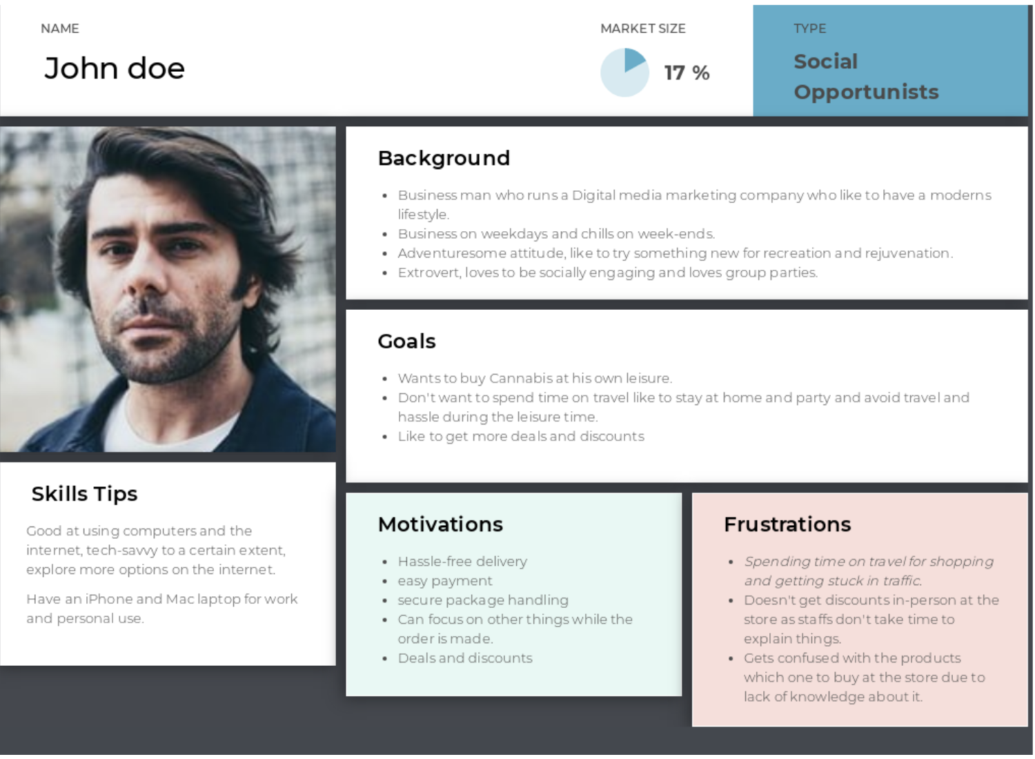
User Persona
04
Card Sorting
Card Sorting tasks were performed via an online platform – Optimal workshop. For implementing the card sorting, the site map was curated based on the user persona and competitive analysis, and the card sorting was developed with appropriate label names.
Participants recruitment
Based on the user persona, the three participants were selected. And the link of the card sorting is sent to evaluate,
Click here to check card sorting.
Card Sorting test - Results


Total Participants :
3
Average time for completion :
1m47s
Task completion :
3/3 participants completed successfully
05
Tree Testing
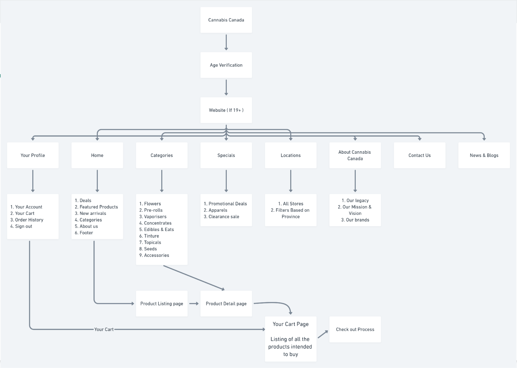
Once the site map is finalized based on the cart sorting task’s results, further testing tree task was implemented for cross-verification purposes. Thereby scenario-based tasks are defined for the tree testing.
Task 1
Considering you are having a vacation after a stressful project, you like to try out some Cannabis for fun and relaxation, you are wanted to buy some flowers, Where do you go look for it?
Task 2
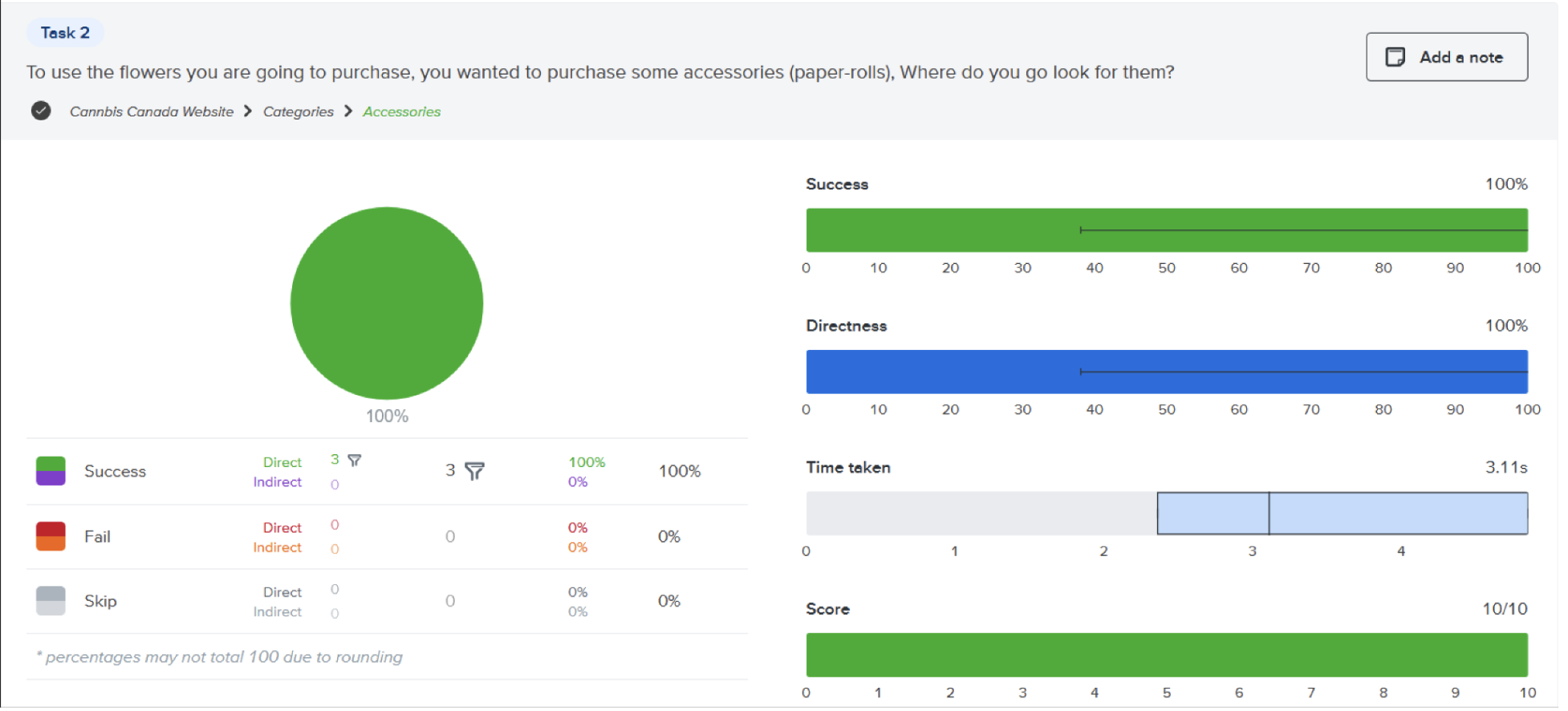
To use the flowers you are going to purchase, you wanted to purchase some accessories (paper-rolls), Where do you go look for them?
Task 3
As you figured out the product you like to buy the product, now you look if there are any offers available so you can apply for a discount, where do you look for it?
Test URL Task 1 & 2: https://whwvxk0w.optimalworkshop.com/treejack/z580bnw8
Test URL for Task 3: https://ila8alg1.optimalworkshop.com/treejack/pi83loxo
Tree testing - Results
Analysing the results obtained from the tree test we see that the participants can successfully accomplish the defined tasks without any struggle and hence we finalize the information architecture site map and proceed with the further process of creating low fidelity.

Task 1
Task 2

Task 3
06
Sitemap
07
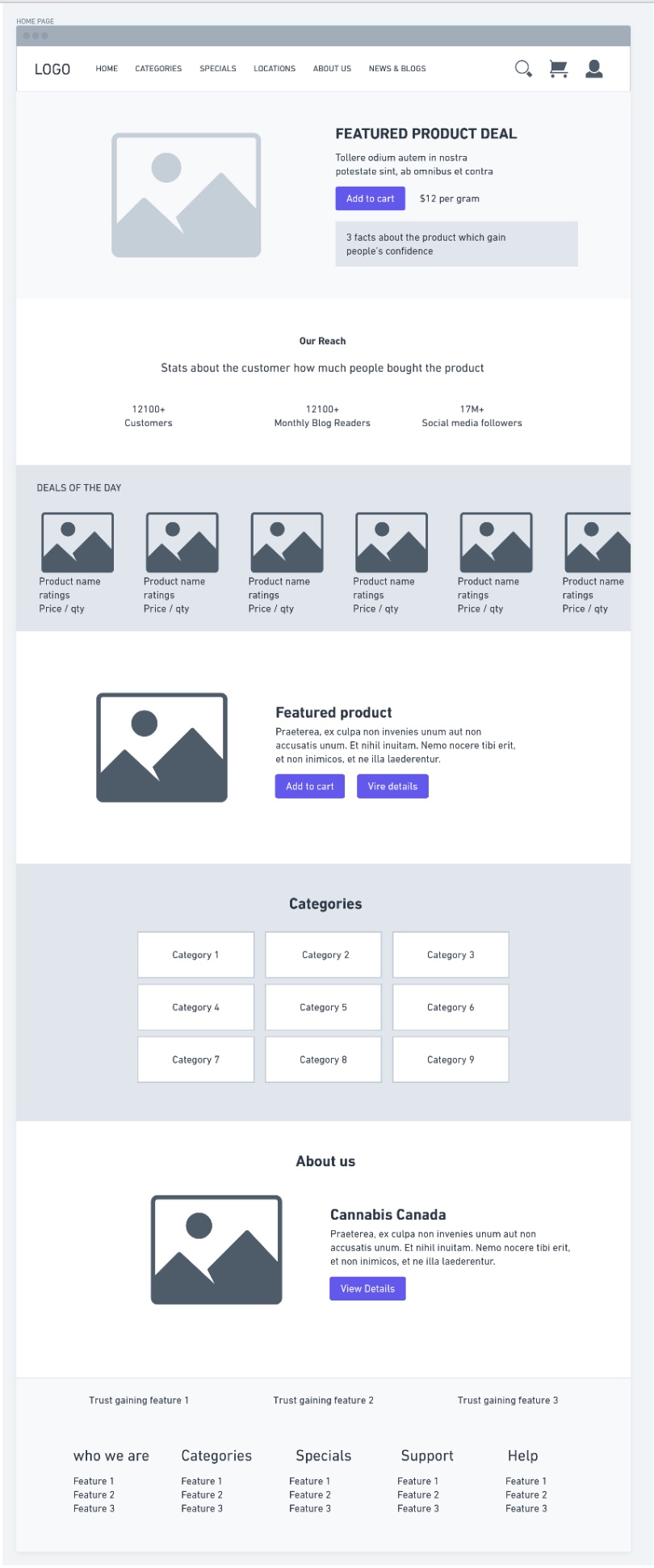
Wireframes
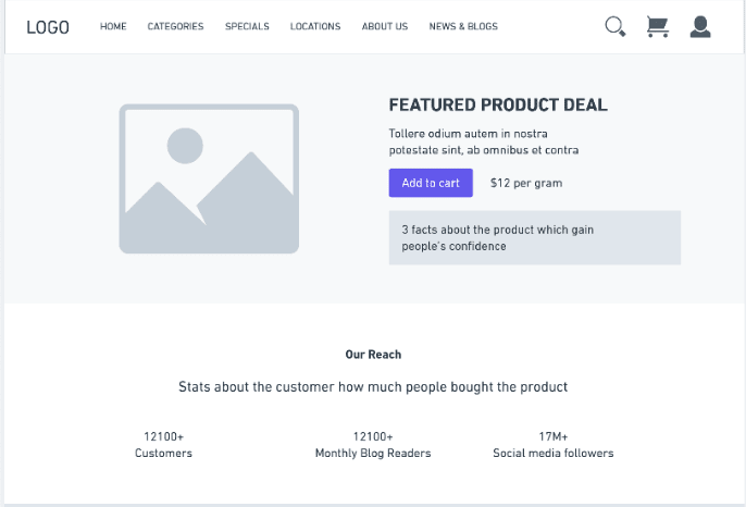
- The wireframe was created using the online platform called whimsical.
- Created the home page based on what the user needs to see on the home page and what features make users engage more with the company/website


08
High fidelity
The fonts used are Roboto Slab for the heading and Poppins for the body, as they are friendly and provide good readability.


