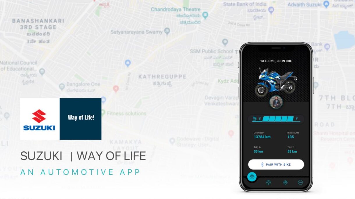
Suzuki Connect

Created to make an impact
An automobile utility product

  • Client Suzuki Motors
  • Project Duration 1.5 Months
  • Services Mobile App

Overview

Suzuki Connect is a utility mobile application that provides features such as hands-free navigation, the last parked location of the bike, recording recent trips with the trip details & save some favorite trips. It also gives you the stats such as total distance, current fuel level, the number of trips traveled, and the average bike speed while driving.

Project Links

Overview

Suzuki Connect is a mobile utility application that provides features such as hands-free navigation, the last parked location of the bike, recording recent trips with the trip details, and save some favorite trips. It also gives you stats such as total distance, current fuel level, number of trips traveled, and average speed of the bike while driving. 

The Challenges

1. Creating a useful utility application program for people to overcome the basic problems of navigating while using a motorcycle by syncing with the dashboard.
2. Considering how to reflect the product’s usage and the deep symbiotic relationship between the mobile application and the automobile.

Goals & Problems

After interviewing different people, I concluded that people mostly use their phones for navigation while driving a two-wheeler vehicle act as a distraction & there seems to be causing an act of accidents.

Before creating the concept, I conducted research and interviews and created a user flow & CMJ. All these actions gave me a deep understanding of the topic, which allowed me to create a convenient, functional, and easy-to-use application.

My Role

I began this product design as a user experience (UX) and user interface (UI) designer for this project. I obtained constructive feedback from two other designers to develop other design aspects.

Main Tasks

1. End-user Insights & Ideation

2. Framing the Project Vision

3. Planning and scope definition

4. User Interface & Experience

5. Motion Interaction


Design tool Kit

Design

A primary step of the design process involved user interviews and desk research to understand how competitors and users behave. I believe getting this information early in the process is important before having an idea or prototyping.

After analyzing this insight, I started to conceptualize the explication, focusing on user flows and wireframes, which provided me a way to iterate faster through my thoughts. With further progression, I went to the production mode, designing the interface while considering design principles such as contrast, hierarchy, and feedback; brand attributes; user interactions; and the imagistic universe presented as a briefing by the case.

Once the interface was ready, I took feedback from two other fellow designers to understand the experience gaps. Although part of my usual design process, validation would be a post-conceptualization and interface step and won’t be discussed in depth in this case.

Design process

01

Research

02

Concept

03

User flows & Wireframes

04

User Interface & Interaction

05

Collecting feedback

06

Validation

User Interviews

User interviews are a core user experience method. That’s why I chose to approach 10 people to interview, taking into account the recommendation from Donald Norman’s article, “Why You Only Need to Test with 5 Users,” noting that it is possible to learn about 80% of the errors, problems & behaviour from the first 5 users.

Interviewed Audience

The interview sample took into account men & women aged 22 to 40, inserted in the economically active population of Bangalore, Chennai & with different usability habits.
The interview was held approximately 10-15 minutes & incorporated topics to get to the core of what users are trying to do & what their problems are.

Questions asked

1. What kind of vehicles do they regularly?
2. What kind of difficulty do they find during their drive?
3. What kind of information do they like to know before and after the ride?
4. What kind of applications do they use when they start to travel?

Customer Insights

After analyzing the interviews, despite the amount of generated data, this was the most relevant information for decision-making in creating the solution:


90%

People believe that it’s better to use digital GPS for navigation rather than using a physical map.


75%

People like to have a log of the trips they are going on and also share it with their personal and social group.

60%

People would not get distracted during their driving time


50%

People prefer to know the data about how they use their bikes & the current status of their vehicles.


User research outcome

What we see is that although 90% of users use the mobile phone for navigation purposes & to store information, would help them by granting easy & faster access, 70% of them say they find it very difficult to use the navigation using GPS application while driving where the navigation is displayed only on the phone.


Desk Research

Additionally, I researched data & habits related to other existing products & applications. The goal was to understand how competitors behave & benchmark innovative designs & products.
With relevant examples to the discussion, such as TVS n-torq, Hero, Suzuki Connect & Tesla. Addressing different features for Functionalities & usabilities.


Wireframing

The Wireframe was designed to build the structure and architecture of the information and only go to visuals and interactions. Samples of screens were done for wire-framing.


Typography

Since the application requires better readability, we have to choose a font family as the font looks friendly and also legible to read the texts irrespective of the situation; we understand that this could be used as an opportunity in the app interface. Therefore, we combine Roboto san-serif typography with a sans-serif Circular.


ROBOTO

ABCDEFGHIJKLMNOPQRSTUVWXYZ
abcdefghijklmnopqrstuvwxyz

Color

The brand’s guidelines led us to pick the theme as dark grey & the primary color as Takumi Blue due to the following reasons :
1. Feels like an integral feature, not a separate entity.
2. Better visibility under direct sunlight.
3. Optimised battery consumption


User Interface

Validation

The Utility Product should not become just a one-time delivery. It should be iterated by considering usability tests, A/B tests, and other in-depth surveys with the user to improve the initial version.

This being said, the implementation of this feature is only the first step toward the success of the product. This would be important to understand success and elaborate the product route map by analyzing metrics such as reading time, daily reading frequency, totals collected over time, and the interests gathered on board. 


error: Content is protected !!