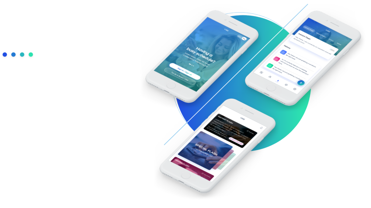
Vibe

Through a wide variety of mobile applications, we’ve developed a unique visual system and strategy that can be applied across the spectrum of available applications.

Brief

Good products aren’t only visually remarkable but stunning in the experience of use, and how to solve the fundamental problems for users & create value for the platform.
The following displays include UI / UX design, brand design & animation design. The overall style is calm and stylish, reflecting the safety & other qualities in the design, which continues the new design trends, makes a complete design specification system & use a technology style & Blue gradient as the main tone.

01

User Persona

Entrepreneur

Al Arshad | 31 years

Hello, I want to focus on work more and don’t want to distracted by the phone calls and lose my efficiency, also I don’t want to mix my personal life & work life.

Site Engineer

Juma al Majid | 26 years

Hello, I want to focus on work more also my job involved traveling to remote location I wanted my family to be well informed as I might not be able to pick the call or not reachable.

Store manager

Lama Asker | 28 years

Hello, As I have guide & help many customers consistently in the store I am not able to look into phone and might miss the calls, so I want the people to be informed regarding my schedule.

02

Design Goals

Focus on use

Reduce the cost of use

Clear data visualization

Improve efficiency

Unified interactive experience

Improve awareness of the function itself.

03

Work Flow

After determining the design goals, Comb the pages and determine the necessary pages.

Dashboard
Create New Flash
Existing Flash
Contacts
Sync Contacts
Add Recipients Manually
Groups
My Flash Message
Instant Flash
Special Flash
Status Flash
Prayer Flash
Driving Flash
Setup & Controls
Settings
Security
Account settings
Language
Blacklist
FAQ
About

04

Colors

Simple graphics & high-saturation graphics can release user pressure in functional apps, visually improve the style of the app & attract users’ attention.

Blue-Green
Gradient

214FE3
2CE2B0

Blue
Gradient

80ACFE
4974FC

Red
Gradient

F89DC9
E1046F

Green
Gradient

3EF7C4
1DD5A2

05

Font

An ordered and reasonable font classification is an indispensable part of an excellent app.
Fonts are divided into reading fonts, digital fonts, and total fonts.
The font used for this variant is “Origin.”
1. Origin font is more friendly to the user and has different scripts.
2. Since this font comes in various styles, it’s great for a heading, subheading, and body copy for consistent design flow.
3. Origin is used in modular websites. Also, user experience-wise, it takes less effort compared to getting an idea of what the content type is.


06

Wireframes

Wireframes helped me & technical team to visualize what the product would look like. To build fast concepts, I start with paper wireframes.  Proceeding on to a high-fidelity prototype, which can be used for analyzing the  viability with the technical team.

On-boarding Screen

Mobile Sign-in & Sign-up

Flash Listing Screen

Create Flash

07

User Interface

Login Screens

Make good use of copywriting on the registration page, reflecting the usability & ease of use of the product and style of the product.

On-boarding Screen

Mobile number

Verification Code

New user registration 

Unlocking with PIN

Biometrics Unlocking

Icons

As a design element in the page, the icon has a significant expression prompt function, and the design on the icon style has a great relationship with the product attributes, design concepts, page style collocation & other factors. To highlight the efficiency attributes of the product, linear icons are used in the design. The content is simple and easy to understand through the simple, atmospheric, and exquisite design, which reduces the user’s uneasiness & the cost of user understanding.

Tab bar

The visual experience will be softer and lighter after adding motion effects when switching the tab. This is not just action feedback but an expression of the character of the product (the intensity of the motion effect needs to be adjusted according to the complexity of the icon).

Dashboard

For New User

For Existing User

Element Analysis

Whether the feed flow is good enough, one of the criteria is whether the information is organized & whether users can easily find what they need. A reasonable layout & regional distribution is conducive to improving the click rate.

Create Flash

Users can quickly access and create a flash using a Floating action button provided in the Main screens. Usage of cards and spacing on the content to keep the content readable and prevent users from skipping a lot of necessary information. Buttons use prominent colors to stimulate users to apply  to increase platform activity.

Instant Flash

Create Flash : Part 1

Create Flash : part 2

My Flash Page

Maximizing the use of the first screen content while ensuring the integrity of the content display, introducing the emotional design to the narrow the potential distance from customers.


Guide users to focus on the main content on the screen, provide clear and clear information, and convey a refined and efficient brand experience to users.


User multiple methods to enhance the prompt to the target number, enhance the user’s attention, and improve the accuracy of input.


The model window system is based on the need to be built to achieve rapid response to user. Obtain the user’s visual focus through back ground blur. Attract user’s attention.


error: Content is protected !!