Cannabis Canada
Cannabis Canada – A mail-order service for Canadians wishing to purchase quality cannabis products for recreational use.
Design master here to lead businesses on an epic transformation journey! I bring my skills in human-centered design, Design Thinking, user research, and value proposition creation to the table. Let's create products and services that will leave your customers in awe. Adventure awaits!



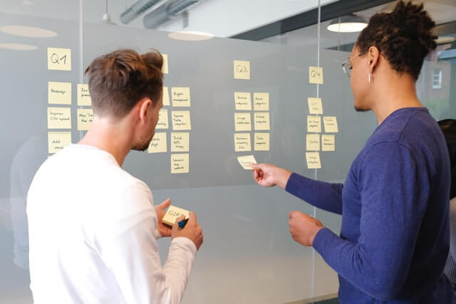
Understand the market, define the audience, and ideate potential solutions.
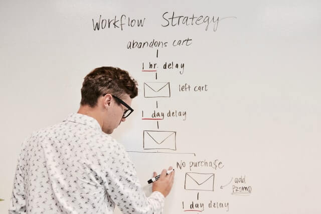
Define the solution, create a roadmap, establish architecture and design the product.
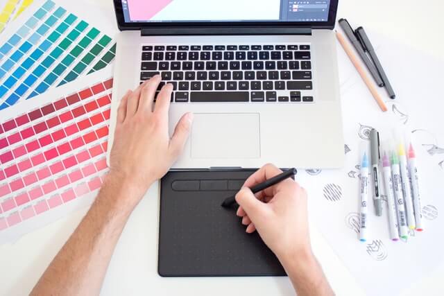
Establish usability, meet accessibility needs and ensure a delightful solution.

Cannabis Canada – A mail-order service for Canadians wishing to purchase quality cannabis products for recreational use.
Cannabis Canada is a mail-order business for Canadians interested in buying high-quality cannabis products for recreational use. Still, we discovered that many consumers were unaware of its existence. To grow and boost business potential, we are marketing the brand and its services by developing a digital product (website) via which individuals (Canadians) will be able to acquire cannabis products for recreational use via Cannabis Canada.
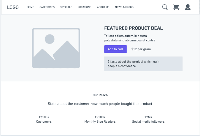
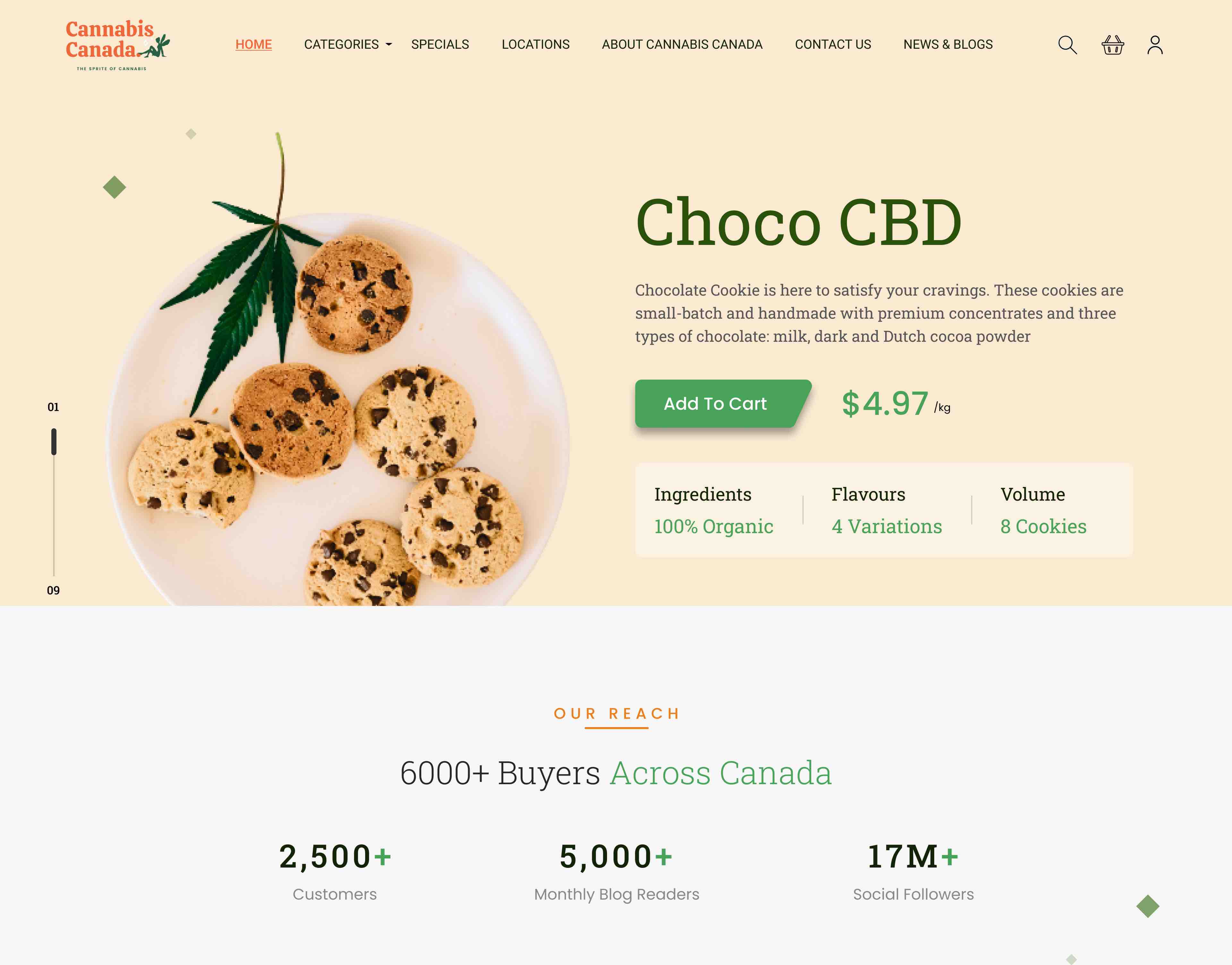
By achieving our short-term objectives, we will be able to establish a digital presence, allowing customers to connect with us online to buy products and obtain more information about them, resulting in increased sales and lower sales costs for the company. Personalized suggestions based on user profiles assist users in finding related products in a hassle-free manner, resulting in increased sales for the company.
Usability tests will be performed on these tasks and iterate your design if necessary based on the outcome of testing. Can revise these tasks once you have completed your competitive analysis if anything important is missed.

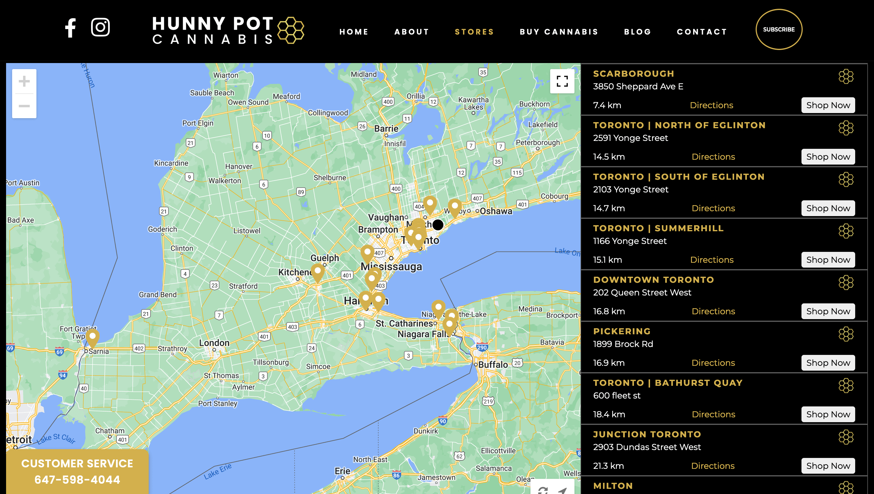
Toronto’s very first legal cannabis store, opening our flagship location at 202 Queen Street West on April 1st, 2019.
The website and the colour scheme convey a luxury feel. The content conveys a welcoming and comfortable feeling regarding the things supplied on the website.
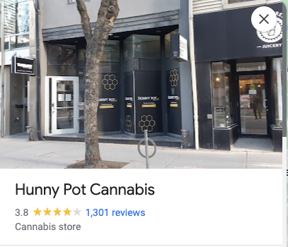
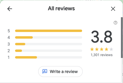
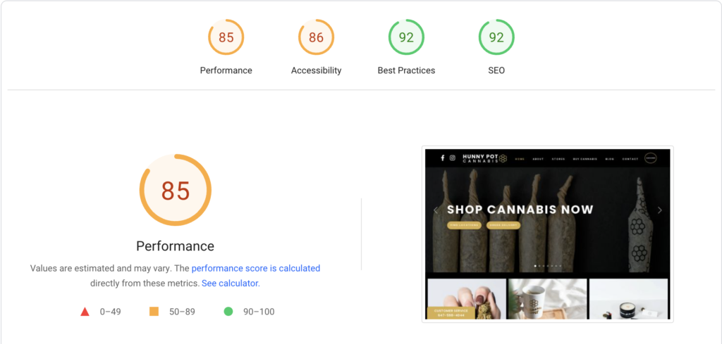


Toronto Hemp Company (THC) is perhaps the world’s largest and most significant cannabis culture/hemp/pot/bong/vaporizer/head shop! Established in 1994 and located in the heart of downtown Toronto, THC is a “hemp shop,” “head shop,” or “smoke shop,” or cannabis/marijuana/hemp culture store” – a retail store and resource center providing high-quality hemp and related products and information.


Minimal clicks are required for the users to purchase the product.
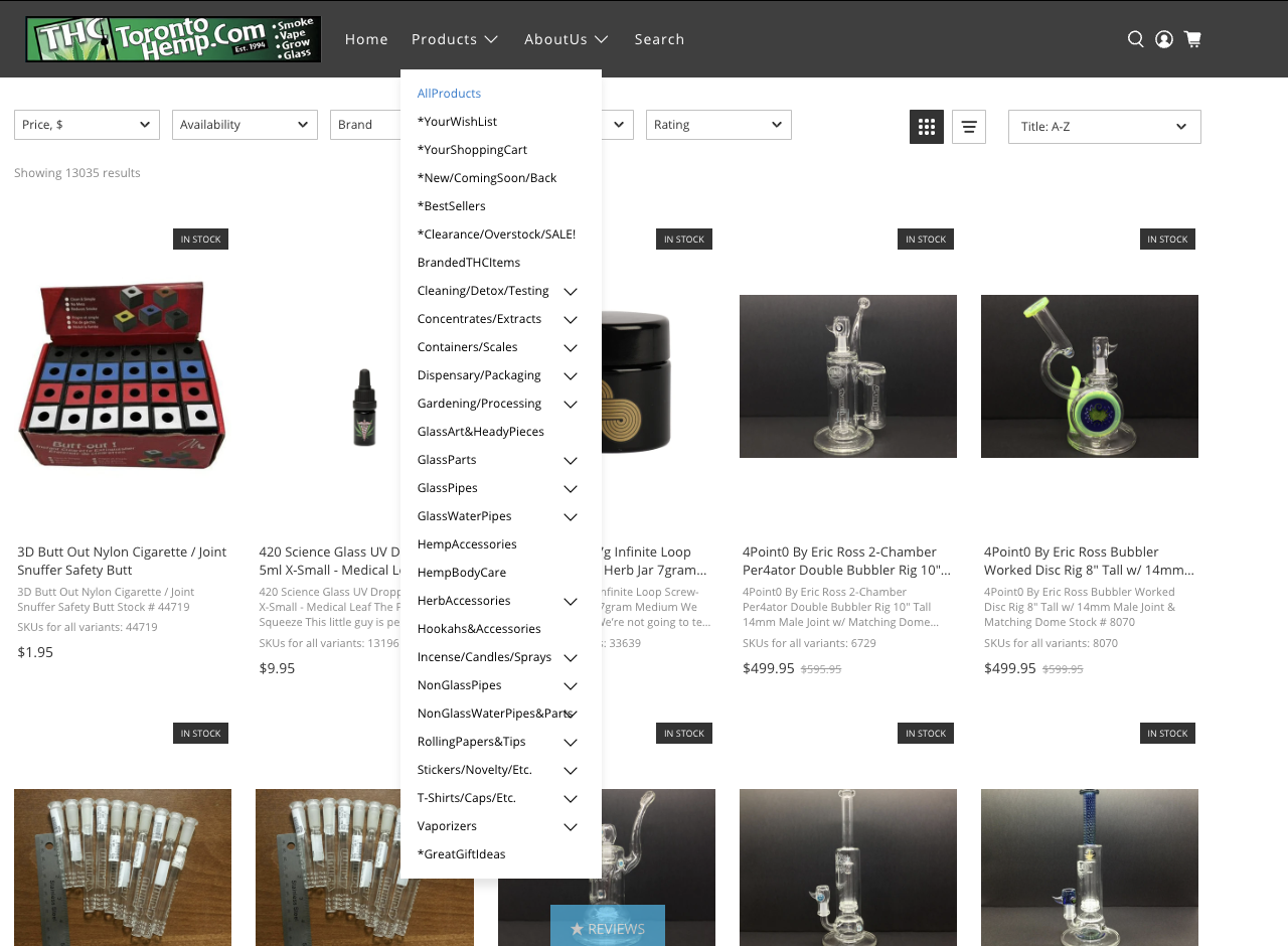
The categories have overwhelming amount of data takes time to go through each and every content

Gas Dank is Canada’s premier mail-order service. We provide same-day delivery across the GTA and express mail delivery across Canada. They assist users in discovering our world of carefully crafted premium cannabis. They were established in 2018.
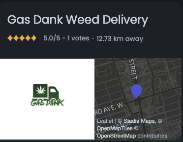
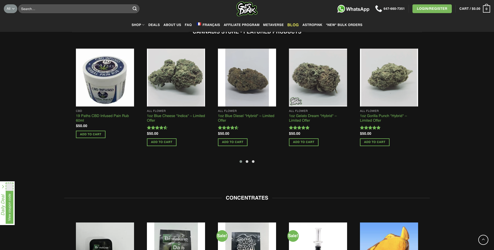
Pretty straightforward in terms of the flow and easy to buy the product.

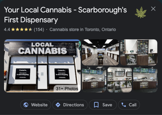
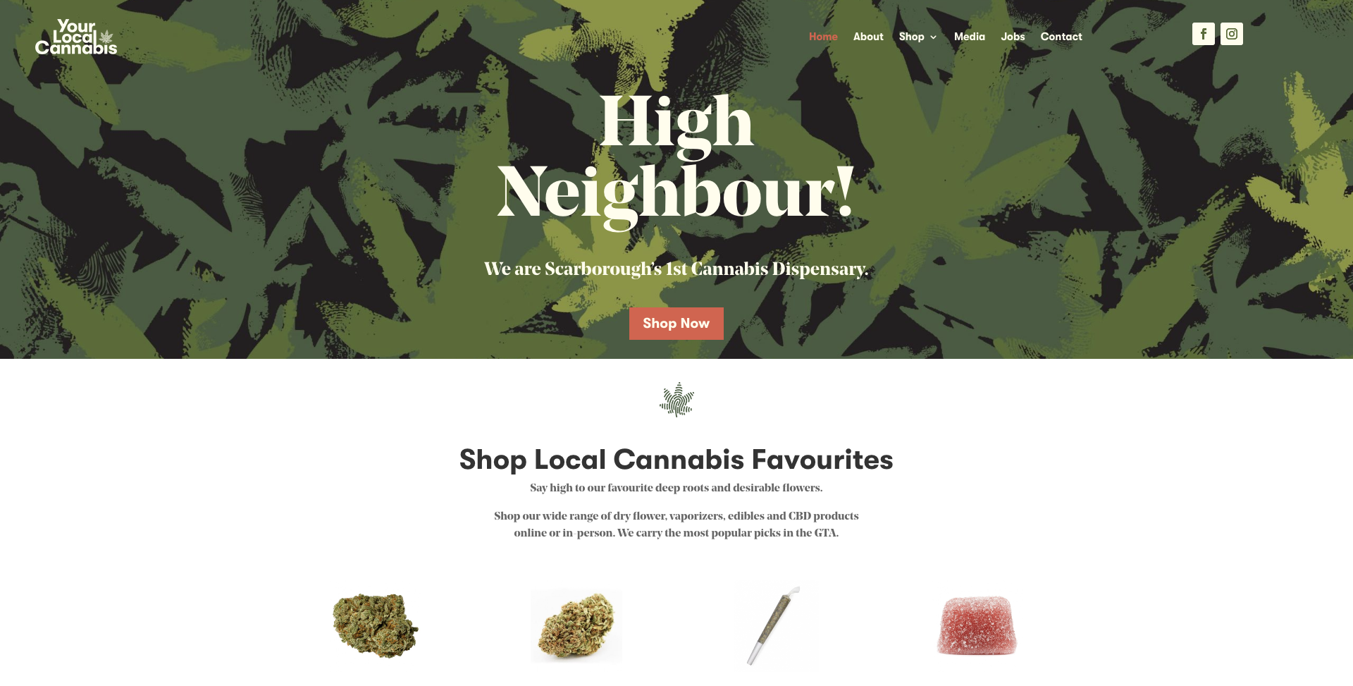
Local Cannabis Scarborough’s first legal and licensed retail cannabis store. They are direct competitors and have multiple stores in Scarborough, which appear to be premium and focused on quality.


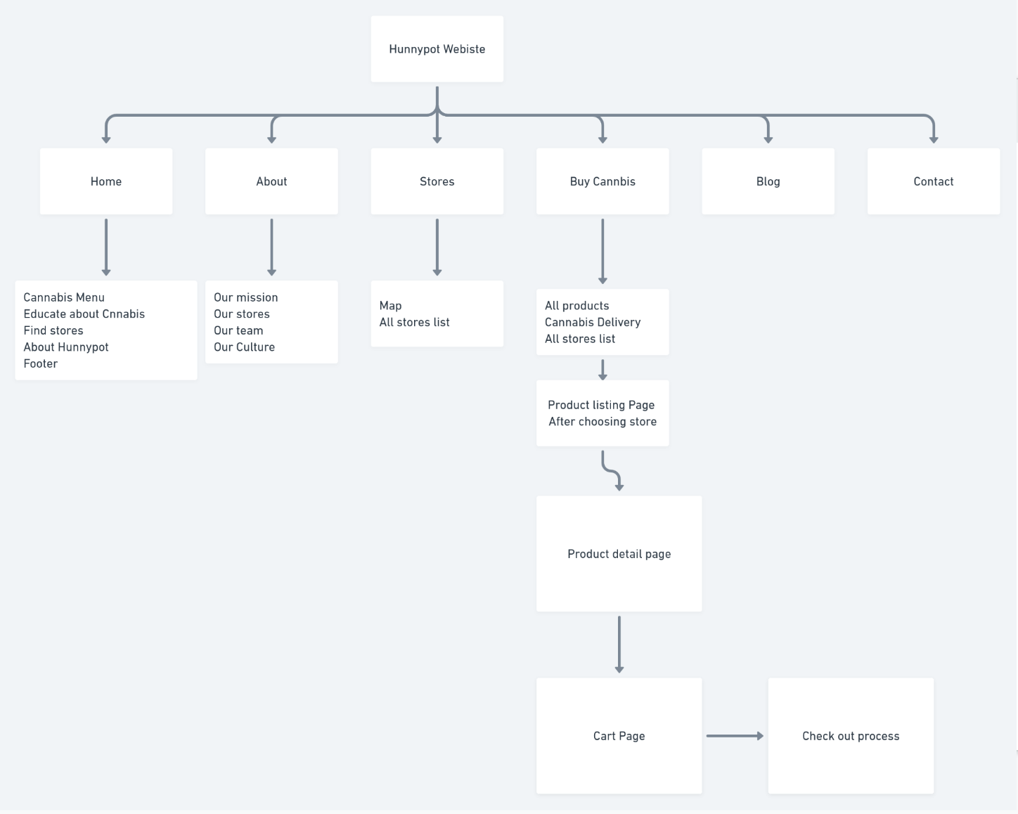
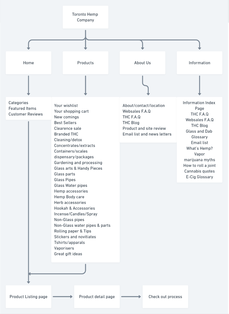
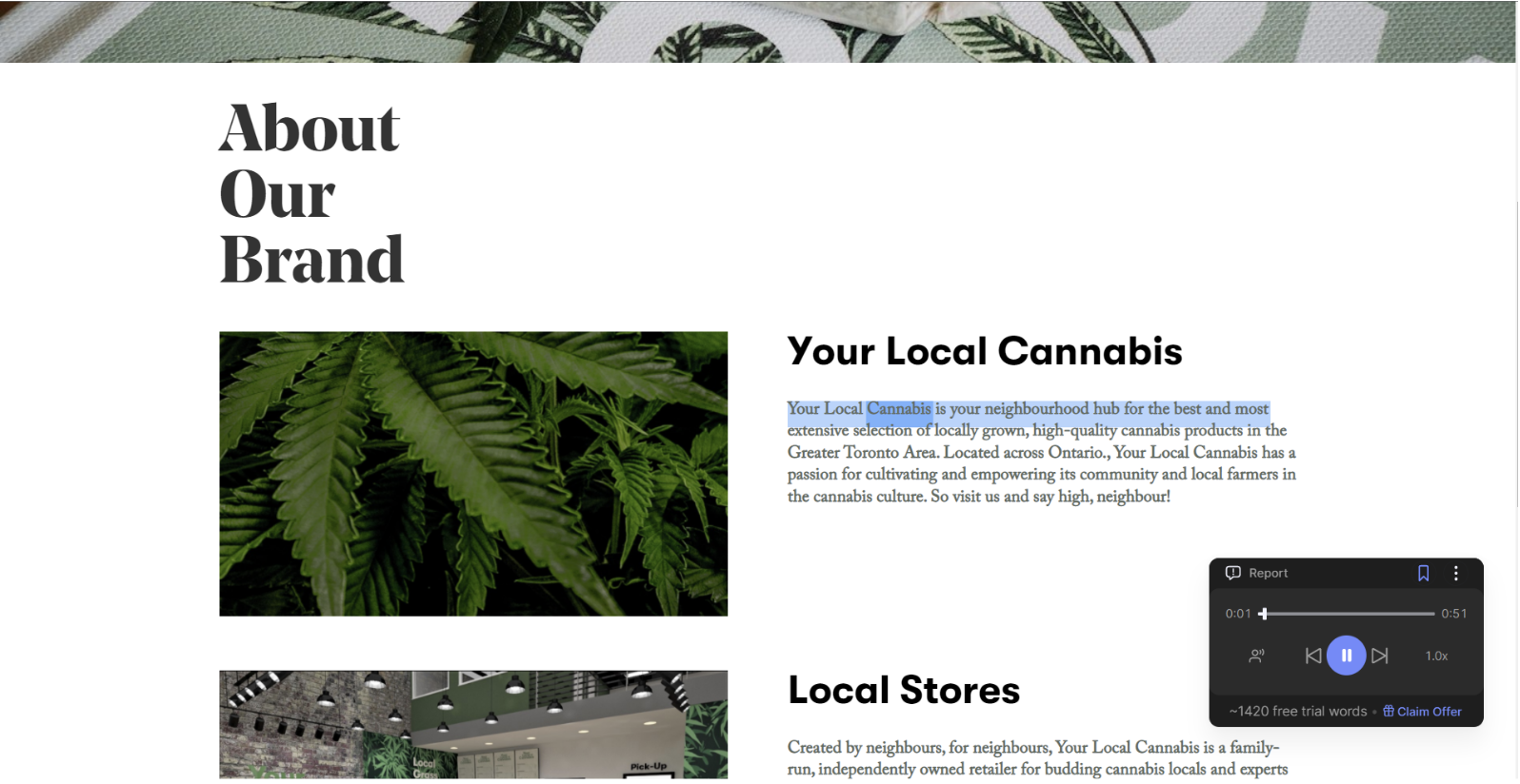
The information architecture of the website is good and seems appropriate but considering the clicks to buy a product is 5 which is relatively good. Interactions used in the website for the people to navigate and understand is good along with that website is incorporated with the accessibility assisting features which adds value in terms of the inclusivity, for example, reading the passages for the people.
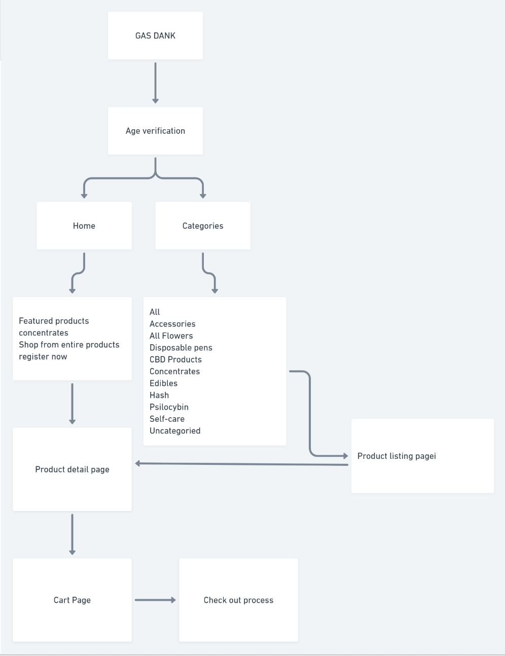
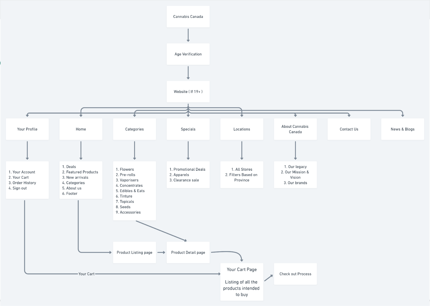
The site map is clear and follows the traditional e-commerce template, which reduces the cognitive load for the users.
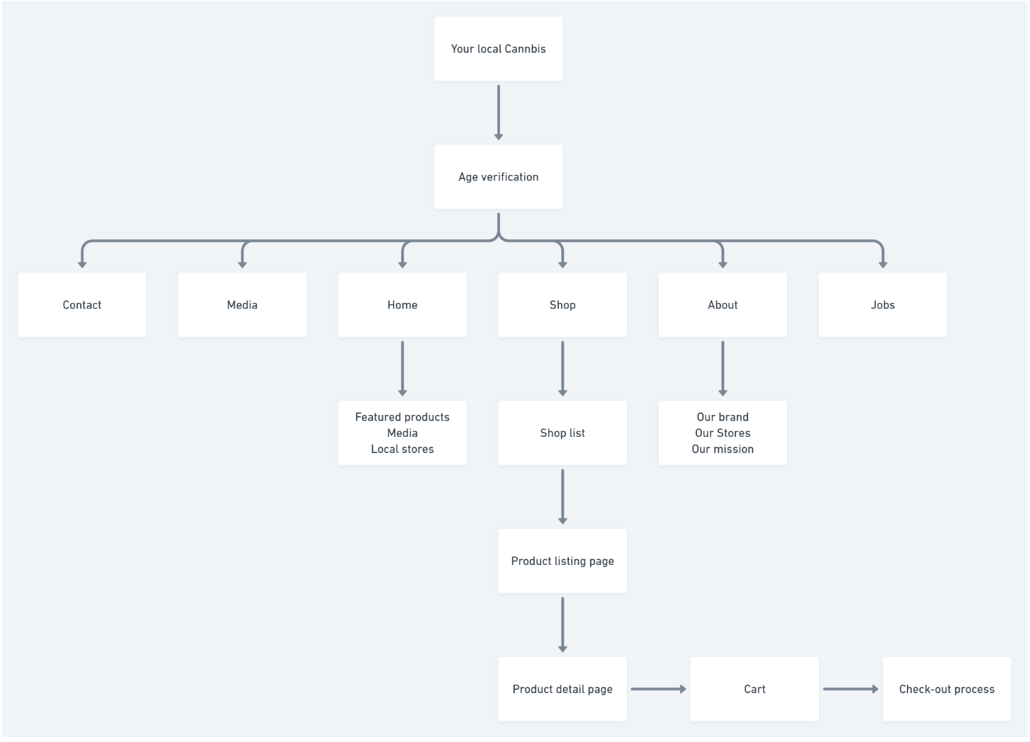
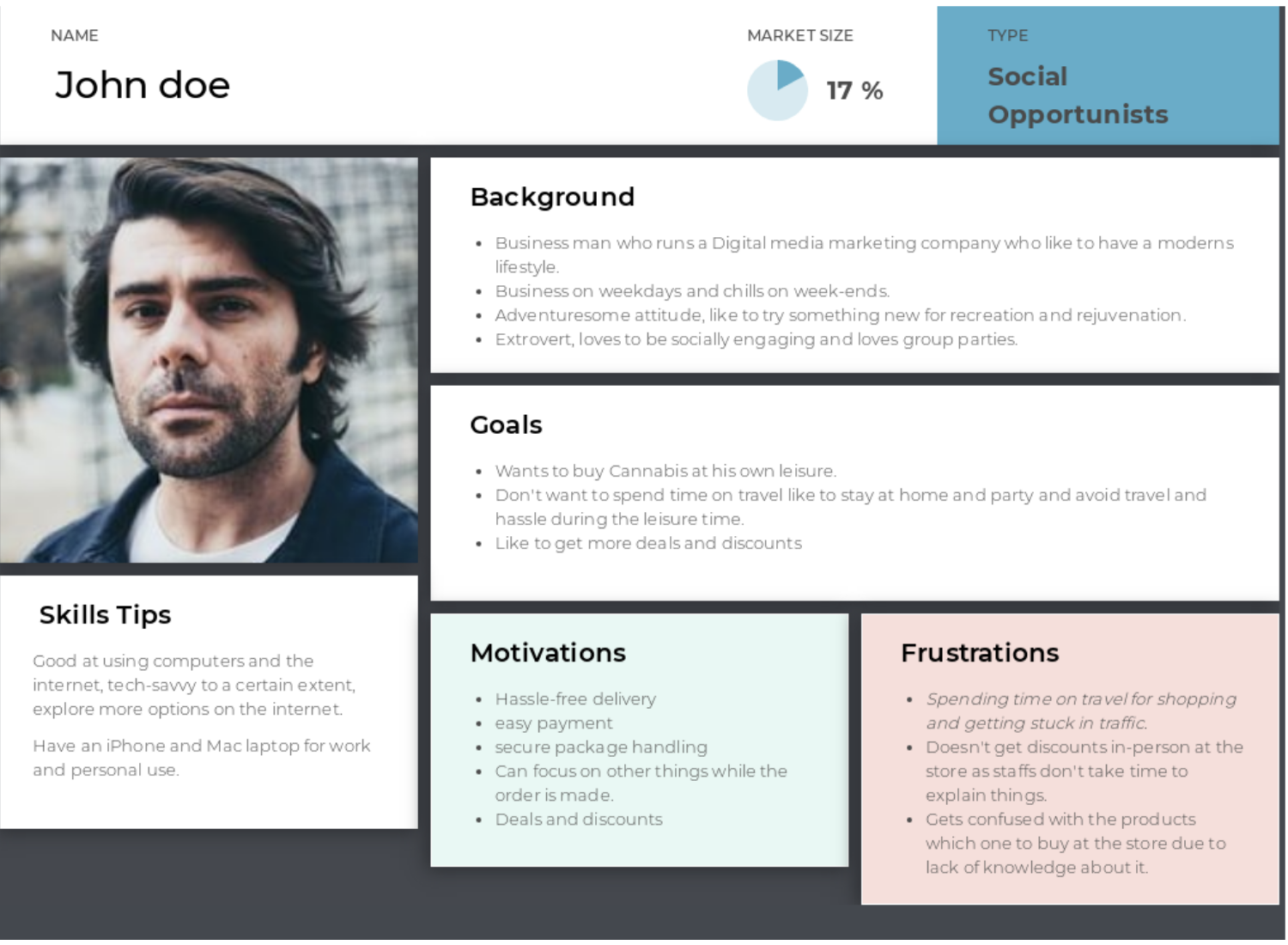
Card Sorting tasks were performed via an online platform – Optimal workshop. For implementing the card sorting, the site map was curated based on the user persona and competitive analysis, and the card sorting was developed with appropriate label names.
Based on the user persona, the three participants were selected. And the link of the card sorting is sent to evaluate,
Click here to check card sorting.


Total Participants :
3
Average time for completion :
1m47s
Task completion :
3/3 participants completed successfully
Once the site map is finalized based on the cart sorting task’s results, further testing tree task was implemented for cross-verification purposes. Thereby scenario-based tasks are defined for the tree testing.
Considering you are having a vacation after a stressful project, you like to try out some Cannabis for fun and relaxation, you are wanted to buy some flowers, Where do you go look for it?
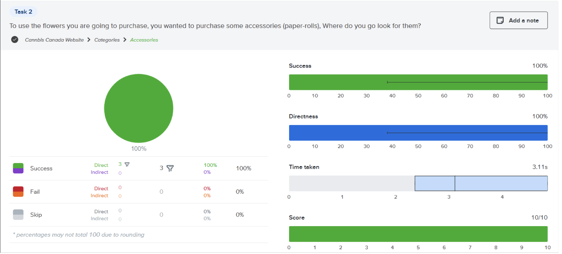
To use the flowers you are going to purchase, you wanted to purchase some accessories (paper-rolls), Where do you go look for them?
As you figured out the product you like to buy the product, now you look if there are any offers available so you can apply for a discount, where do you look for it?
Test URL Task 1 & 2: https://whwvxk0w.optimalworkshop.com/treejack/z580bnw8
Test URL for Task 3: https://ila8alg1.optimalworkshop.com/treejack/pi83loxo
Analysing the results obtained from the tree test we see that the participants can successfully accomplish the defined tasks without any struggle and hence we finalize the information architecture site map and proceed with the further process of creating low fidelity.


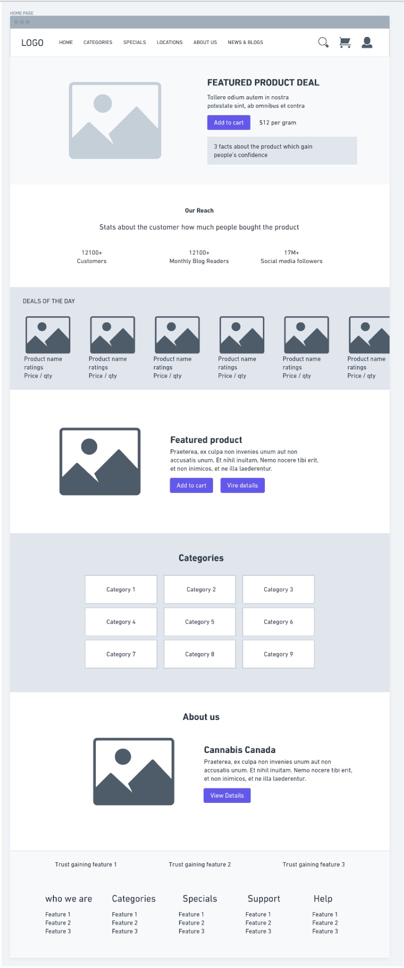


The fonts used are Roboto Slab for the heading and Poppins for the body, as they are friendly and provide good readability.


Created to make an impact
An automobile utility product
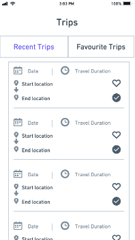
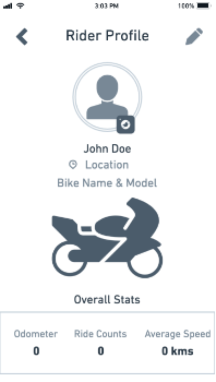
Suzuki Connect is a utility mobile application that provides features such as hands-free navigation, the last parked location of the bike, recording recent trips with the trip details & save some favorite trips. It also gives you the stats such as total distance, current fuel level, the number of trips traveled, and the average bike speed while driving.
Suzuki Connect is a mobile utility application that provides features such as hands-free navigation, the last parked location of the bike, recording recent trips with the trip details, and save some favorite trips. It also gives you stats such as total distance, current fuel level, number of trips traveled, and average speed of the bike while driving.
1. Creating a useful utility application program for people to overcome the basic problems of navigating while using a motorcycle by syncing with the dashboard.
2. Considering how to reflect the product’s usage and the deep symbiotic relationship between the mobile application and the automobile.
After interviewing different people, I concluded that people mostly use their phones for navigation while driving a two-wheeler vehicle act as a distraction & there seems to be causing an act of accidents.
Before creating the concept, I conducted research and interviews and created a user flow & CMJ. All these actions gave me a deep understanding of the topic, which allowed me to create a convenient, functional, and easy-to-use application.
I began this product design as a user experience (UX) and user interface (UI) designer for this project. I obtained constructive feedback from two other designers to develop other design aspects.
1. End-user Insights & Ideation
2. Framing the Project Vision
3. Planning and scope definition
4. User Interface & Experience
5. Motion Interaction

A primary step of the design process involved user interviews and desk research to understand how competitors and users behave. I believe getting this information early in the process is important before having an idea or prototyping.
After analyzing this insight, I started to conceptualize the explication, focusing on user flows and wireframes, which provided me a way to iterate faster through my thoughts. With further progression, I went to the production mode, designing the interface while considering design principles such as contrast, hierarchy, and feedback; brand attributes; user interactions; and the imagistic universe presented as a briefing by the case.
Once the interface was ready, I took feedback from two other fellow designers to understand the experience gaps. Although part of my usual design process, validation would be a post-conceptualization and interface step and won’t be discussed in depth in this case.
Research
Concept
User flows & Wireframes
User Interface & Interaction
Collecting feedback
Validation
User interviews are a core user experience method. That’s why I chose to approach 10 people to interview, taking into account the recommendation from Donald Norman’s article, “Why You Only Need to Test with 5 Users,” noting that it is possible to learn about 80% of the errors, problems & behaviour from the first 5 users.


The interview sample took into account men & women aged 22 to 40, inserted in the economically active population of Bangalore, Chennai & with different usability habits.
The interview was held approximately 10-15 minutes & incorporated topics to get to the core of what users are trying to do & what their problems are.
1. What kind of vehicles do they regularly?
2. What kind of difficulty do they find during their drive?
3. What kind of information do they like to know before and after the ride?
4. What kind of applications do they use when they start to travel?
Customer Insights
What we see is that although 90% of users use the mobile phone for navigation purposes & to store information, would help them by granting easy & faster access, 70% of them say they find it very difficult to use the navigation using GPS application while driving where the navigation is displayed only on the phone.
Additionally, I researched data & habits related to other existing products & applications. The goal was to understand how competitors behave & benchmark innovative designs & products.
With relevant examples to the discussion, such as TVS n-torq, Hero, Suzuki Connect & Tesla. Addressing different features for Functionalities & usabilities.


ABCDEFGHIJKLMNOPQRSTUVWXYZ
abcdefghijklmnopqrstuvwxyz


The Utility Product should not become just a one-time delivery. It should be iterated by considering usability tests, A/B tests, and other in-depth surveys with the user to improve the initial version.


Through a wide variety of mobile applications, we’ve developed a unique visual system and strategy that can be applied across the spectrum of available applications.
Good products aren’t only visually remarkable but stunning in the experience of use, and how to solve the fundamental problems for users & create value for the platform.
The following displays include UI / UX design, brand design & animation design. The overall style is calm and stylish, reflecting the safety & other qualities in the design, which continues the new design trends, makes a complete design specification system & use a technology style & Blue gradient as the main tone.

Hello, I want to focus on work more and don’t want to distracted by the phone calls and lose my efficiency, also I don’t want to mix my personal life & work life.

Hello, I want to focus on work more also my job involved traveling to remote location I wanted my family to be well informed as I might not be able to pick the call or not reachable.

Hello, As I have guide & help many customers consistently in the store I am not able to look into phone and might miss the calls, so I want the people to be informed regarding my schedule.
Focus on use
Reduce the cost of use
Clear data visualization

Improve efficiency
Unified interactive experience
Improve awareness of the function itself.
After determining the design goals, Comb the pages and determine the necessary pages.
Simple graphics & high-saturation graphics can release user pressure in functional apps, visually improve the style of the app & attract users’ attention.

214FE3
2CE2B0

80ACFE
4974FC

F89DC9
E1046F

3EF7C4
1DD5A2
An ordered and reasonable font classification is an indispensable part of an excellent app.
Fonts are divided into reading fonts, digital fonts, and total fonts.
The font used for this variant is “Origin.”
1. Origin font is more friendly to the user and has different scripts.
2. Since this font comes in various styles, it’s great for a heading, subheading, and body copy for consistent design flow.
3. Origin is used in modular websites. Also, user experience-wise, it takes less effort compared to getting an idea of what the content type is.


On-boarding Screen

Mobile Sign-in & Sign-up

Flash Listing Screen

Create Flash

On-boarding Screen

Mobile number

Verification Code

New user registration

Unlocking with PIN

Biometrics Unlocking


For New User

For Existing User


Instant Flash

Create Flash : Part 1

Create Flash : part 2

Maximizing the use of the first screen content while ensuring the integrity of the content display, introducing the emotional design to the narrow the potential distance from customers.

Guide users to focus on the main content on the screen, provide clear and clear information, and convey a refined and efficient brand experience to users.

User multiple methods to enhance the prompt to the target number, enhance the user’s attention, and improve the accuracy of input.

The model window system is based on the need to be built to achieve rapid response to user. Obtain the user’s visual focus through back ground blur. Attract user’s attention.


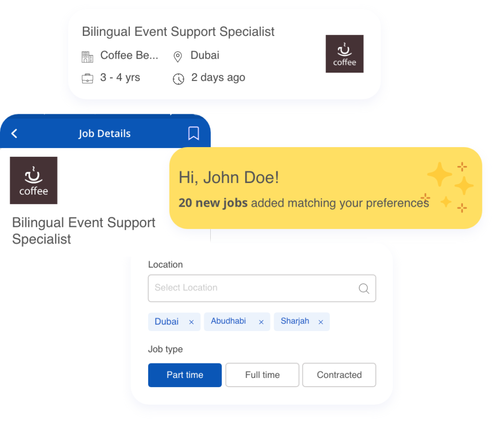
Through this app, people can find new jobs and explore new opportunities to pursue their dreams.
In modern days everyone wants to be independent, So jobs are preferred. I have designed this application to make the job hunt at ease, also most of people gets frustrated to get the right jobs what they are looking for so to improvise the situation, by showing the relevant jobs based on the skillset of the individual.
On-board with Jobsworld
Upload your documents
Get personalized job suggestions
Apply for the best opportunities
Attend interview & get shortlisted
Pursue your dream with happiness


A B C D E F G H I J K L M N O P Q R S T U V W X Y Z
a b c d e f g h i j k l m n o p q r s t u v w x y z
1 2 3 4 5 6 7 8 9 0

#0A56B6

#ECF3FC

#303030

#FFDF63
Quick and easy sign-up with essential fields in the form.

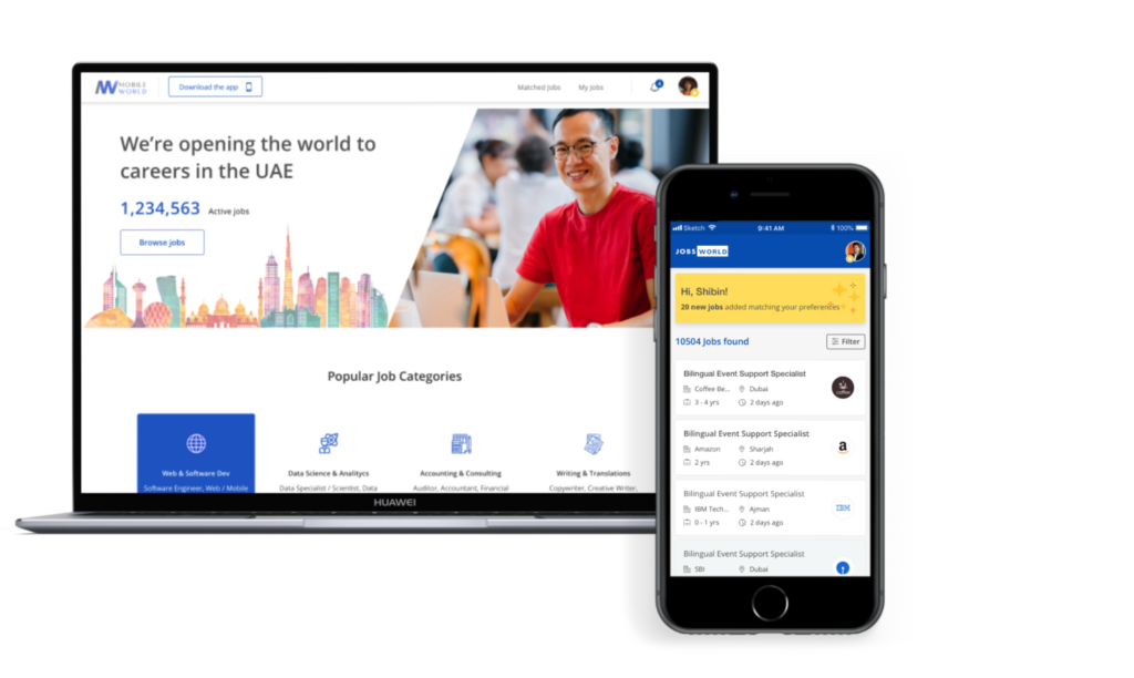
Home page with personalized offers,
around popular and nearby jobs.
Find the right job, sort by salary, location & position type.
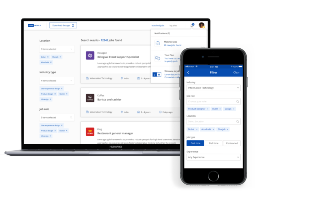

Manage all the applications & make decisions.

I created user-centric digital design solutions for clients, including web and mobile platforms. The process consists of creating a user persona, conducting user interviews, setting up the mood board & design system, formulating the user flows, user stories, low-fidelity wireframes, and High fidelity design prototypes, and communicating with the clients regarding the project deliverables.
Worked as part of Cadd center’s education & marketing team; my role there was to train people regarding the mechanical design software ( Autocad - 2D, CATIA - 3D, Ansys workbench, Ansys Fluent - Analysis) with the industrial standards, develop workshops & talks to students & teachers about how they can take advantage of the courses provided to increase their school, work productivity & improvise the prospects of continues employment.
In this course, I learned the flow of how a project works. I also learned what documents need to be prepared and how to manage the timeline, budget, and team according to best practices followed by PMI.
The specialization I obtained comprises courses covering topics such as Visual Elements of User Interface Design, UX Design Fundamentals, Web Design: Strategy and Information Architecture & Web Design: Wireframes to Prototypes.
During this course, I got exposure to the broad areas of Mechanical Engineering, namely Design, Manufacturing, Energy, Thermal Sciences, and currently related interdisciplinary areas.
